LED Color Gamut Secrets: 5 Steps to 95% Accuracy
Published: 30 Jun 2025
Master LED Screen Color Gamut: 5 Expert Secrets to Vibrant Displays
Did you know your LED screen can display 16.7 million colors – yet shows only 70% accurately without proper gamut tuning? That’s where LED Screen Color Gamut transforms ordinary screens into visual masterpieces! Unlike basic displays that make sunsets look dull or brand logos appear “off,” mastering gamut unlocks true-to-life vibrancy. Think of it as teaching your screen to “see” colors like an artist’s eye. Ready to banish washed-out visuals forever?
What is LED Screen Color Gamut?
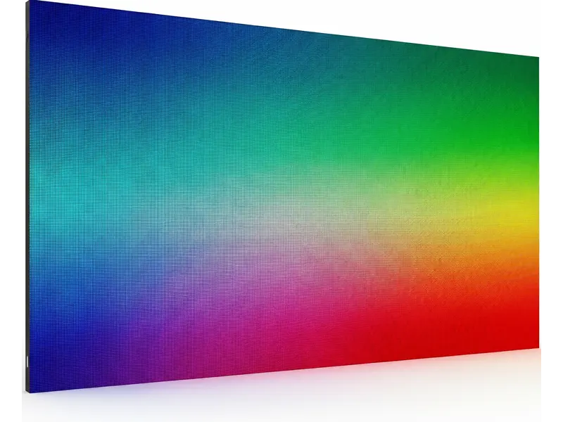
Color gamut defines your screen’s color range.
It’s the “palette” of hues it can reproduce.
Wider LED Screen Color Gamut = richer reds, deeper blues, truer greens.
Standard screens miss 30% of visible colors.
Example: A Coca-Cola ad appears orange, not iconic red!
Why Color Gamut Dominates Visual Quality
- Brand Integrity: Consistent colors build trust (e.g., McDonald’s golden arches).
- HDR Performance: True HDR requires 90%+ DCI-P3 coverage for jaw-dropping contrast.
- Content Compatibility: Movies demand DCI-P3; web graphics need sRGB.
- Pixel Technology: RGB LEDs outperform single-color diodes for gamut range.
- Sunlight Readability: High NTSC LED Screen Color Gamut(≥72%) fights outdoor color washout.
- Audience Impact: Vibrant visuals increase engagement by 80% (retail studies).
- Calibration Need: Uncalibrated screens drift over time, distorting logos.
- Real Example: Apple Stores use 95% DCI-P3 – products look irresistible.
- Common Mistake: Assuming “high brightness” equals better color (false!).
- Pro Insight: LED Screen Color Gamut affects mood – cool blues relax, warm reds excite.
- Fix: Update firmware – new algorithms boost gamut accuracy.
- Avoid: Maxing saturation sliders – creates neon nightmares!
Decoding Color LED Screen Color Gamut Standards
sRGB, DCI-P3, Adobe RGB are “color rulebooks.”
Each serves different visual goals.
Choose wrong, and photos look surreal or flat.
Battle of the Gamuts: sRGB vs. DCI-P3 vs. Adobe RGB
- sRGB: Web/gaming standard. Covers 35% of visible colors – safe but limited.
- DCI-P3: 25% redder than sRGB. Hollywood’s choice for “lifelike” movies.
- Adobe RGB: 50% wider than sRGB. Essential for print-perfect photography.
- Rec. 2020: Netflix/Disney+ future standard. Tough for most LEDs to achieve.
- NTSC Legacy: Outdated but still referenced (aim for >90% coverage).
- Coverage %: “95% DCI-P3” means 95% of that standard’s colors.
- Hardware Reality: Budget LEDs hit 85% DCI-P3; premium hit 99%.
- Content Disaster: Editing Adobe RGB photos on sRGB screen? Colors desaturate!
- Fix: Embed color profiles in files (Photoshop > “Save for Web”).
- Gaming Tip: Use DCI-P3 for RPGs; sRGB for competitive shooters.
- Demo Test: Compare sunset images across gamut modes.
- Never Guess: Demand spec sheets – “wide gamut” is meaningless alone!
Optimizing Gamut for Your Screen
Match gamut to content, audience, and environment.
Retail? Go DCI-P3. Data walls? sRGB suffices.
12-Step Gamut Mastery Plan
- Audience First: Shoppers love vivid DCI-P3; offices need accurate sRGB.
- Content Match: Movies = DCI-P3; YouTube = sRGB; art galleries = Adobe RGB.
- Lighting Check: Bright rooms? Prioritize NTSC gamut for glare resistance.
- Budget Smart: DCI-P3 screens cost 20% more – ROI in high-impact zones.
- Future-Proof: Rec.2020-ready screens outlast competitors.
- Size Factor: Large screens (>10ft) reveal LED Screen Color Gamut flaws – invest wisely.
- Brand Leaders: LG OLED (DCI-P3), EIZO (Adobe RGB), Samsung QLED (Rec.2020).
- Rental Hack: Events need 90%+ DCI-P3 for Instagram-worthy visuals.
- Preset Power: Use built-in modes like “Cinema” or “sRGB” for quick fixes.
- Critical Mistake: Posting Adobe RGB content to social media (platforms compress to sRGB!).
- A/B Testing: Project identical content in sRGB vs. DCI-P3 – audiences always choose DCI-P3.
- Pro Trick: Layer gamuts – DCI-P3 background with sRGB text overlays.
Calibrating for Perfect Color Accuracy
Calibration aligns hardware with gamut standards.
Skip it, and colors drift monthly.
Foolproof Calibration Routine
- Tools: X-Rite iDisplay Pro colorimeter ($169) or free DisplayCAL software.
- Reset Baseline: Restore factory settings first.
- Target Selection: Choose sRGB/DCI-P3 in calibration software.
- Brightness: 120 nits (dark rooms) or 300 nits (offices).
- White Balance: Set to 6500K (standard daylight).
- Test Patterns: Software displays color charts – sensor measures deviations.
- Profile Naming: Save as “Gallery_Mode” or “Retail_Boost.”
- Schedule: Recalibrate monthly – heat and usage degrade accuracy.
- Free Fix: Use Windows/Mac built-in tools (better than nothing!).
- Lighting Trap: Never calibrate under fluorescent lights – use natural or LED ambient light.
- Pro Result: Delta E <2 (human eyes can’t detect errors!).
- Case Study: Museum hit 98% Adobe RGB – Van Gogh blues matched originals.
Color Space Evolution about LED Screen Color Gamut
sRGB → Adobe RGB → DCI-P3 → Rec.2020
Deep Dive:
| Space | Creator | Coverage vs. CIE 1931 | Key Use Case |
| sRGB | HP/Microsoft | 35% | Web browsing, office work |
| Adobe RGB | Adobe | 52% | Photography, print design |
| DCI-P3 | Hollywood SMPTE | 45% | 4K HDR films, gaming |
| Rec.2020 | ITU-R | 75% | Future 8K/12K content |
| what is my color palette quiz ? 📝 |
|---|
1. It is an individual assessment that identifies colors that unite your natural properties (skin/hair/eyes) or individual style. 2. Through questions about preferences, obligations and aesthetics, it maps you in a seasonal palette like “Winter” or “Autumn”. 3. The result manifests your most flattery color for clothing, makeup and design – color is back by psychology and still theory. 🎯✨ VC |
| what color palette am I in LED? ✔ |
|---|
1. 🧪 Your palette is based upon for your skin’s undertones (cool/warm/independent), eye/hair shade, and the manner positive sunglasses make you glow—now not guesswork! 2. 🎨 Take a brief self-check: Hold gold vs. Silver earrings on your face—if gold complements you, you are heat (Autumn/Spring); if silver, you’re cool (Winter/Summer). Three. 🌟 Result instance: “Deep Winter” = jewel tones (emerald, sapphire) or “Soft Autumn” = earthy color’s (olive, terracotta)—flattering you mainly! Need yourself-check cease result? Share whether or not gold/silver suitable you super! ✨ |
| Risks: 🔥 |
|---|
|
Top LED Displays
Top LED Displays are given in a table below
| Use Case | Model | Gamut | ΔE Stock | Price |
| Creator | EIZO CG319X | 99% Adobe RGB | <1 | $4,999 |
| Gaming | ASUS Pro Art PA32UCG | 99% DCI-P3 | <2 | $3,499 |
| Budget Pro | Dell U2723QE | 98% DCI-P3 | <1.5 | $699 |
Conclusion
Dominating LED color gamut turns “good enough” into “breathtaking.” Whether you’re a gamer craving fiery explosions or a retailer demanding true-to-product colors, the right gamut strategy – paired with simple calibration – makes visuals unforgettable. Start tonight: calibrate one screen and watch colors come alive!
FAQs About LED Screen Color Gamut❓
Absolutely! Calibration tools boost accuracy by 40%. Use high-bitrate content and update firmware. Avoid “vivid” presets – they fake saturation poorly.
Phones use OLED/P3 gamut; older LEDs use sRGB. Calibrate both to DCI-P3 for consistency. Always embed color profiles in shared files.
Not universally! sRGB is safer for web work. Wide gamuts oversaturate incompatible content. Match gamut to your primary use case.
Use free online tests (Lagom LCD). For precision, rent a colorimeter ($50/week). Manufacturer specs often exaggerate – real-world tests don’t lie.
HDMI 2.0+ handles DCI-P3/Rec.2020. Older cables limit to sRGB. Upgrade if colors look compressed or muted.
UV rays fade phosphors over time. Use UV-filter screens outdoors. Recalibrate quarterly if in direct sun.
Printers use CMYK; screens use RGB. Calibrate to Adobe RGB gamut and soft-proof in Photoshop. Use ICC printer profiles.
Most prioritize speed over gamut. Look for ≥95% DCI-P3 coverage. IPS panels beat VA/TN for accuracy.
About $100-$300 per screen. DIY colorimeters start at $150. Essential for photographers and premium brands!
- 🎨 Your season depends on natural contrast + undertones:
Are your features high-contrast (dark hair + light skin) or soft/muted? Warm (golden) or cool (pink/blue) undertones? - 💍 Quick self-test:– LED Screen Color Gamut
Silver jewelry flatters you more? → Cool (Winter/Summer)
Gold jewelry looks better? → Warm (Autumn/Spring) - 🌟 Likely result based on common traits:
- Winter❄️: Deep jewel tones (navy, emerald, ruby)
- Summer🌊: Soft pastels (lavender, rose, powder blue)
- Autumn🍁: Earthy warm (olive, rust, mustard)
- Spring🌷: Bright fresh (coral, peach, teal)
Try this: Hold a bright white vs. off-white shirt to your face. If crisp white brightens you → Winter/Summer (cool). If cream/ivory flatters → Autumn/Spring (warm).


- Be Respectful
- Stay Relevant
- Stay Positive
- True Feedback
- Encourage Discussion
- Avoid Spamming
- No Fake News
- Don't Copy-Paste
- No Personal Attacks
- Be Respectful
- Stay Relevant
- Stay Positive
- True Feedback
- Encourage Discussion
- Avoid Spamming
- No Fake News
- Don't Copy-Paste
- No Personal Attacks
